Dark Mode vs Light Mode
In today’s digital-first world, UI design choices like light mode and dark mode play a huge role in shaping the user experience (UX). From reducing eye strain to improving readability, the debate between dark mode vs light mode has become one of the most discussed topics in design but is switching between these modes is more than a trend, it’s a smart design choice?
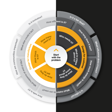
Tech giants including Apple, Google, and Microsoft have embraced both options, giving users the freedom to choose and we have included this in flexibility in the Design Compass.
But which mode truly delivers the best experience? In this article, we’ll break down the benefits and drawbacks of light mode and dark mode, and explore how each impacts usability, accessibility, and overall UX design.
What Is Dark Mode?
Dark mode shows light text on a dark background is becoming increasingly popular, specifically with Gen z’s and Millennials who are likely to switch from light to dark mode by default. It’s ideal for low-light environments and users who prefer a more subdued, modern visual style.
The benefits are
- reduced eye strain at night
- Improved battery life on OLED screens
- Modern, sleek aesthetic
What Is Light Mode?
Light mode is the default for most applications and is familiar to most users with dark text on a light background and it’s the traditional default. It’s great for readability in daylight or brightly lit environments. It is most used by Baby Boomers and Gen X. The benefits are
- Better readability in daylight
- Familiarity for most users
- Stronger accessibility for certain vision needs
Accessibility Considerations: Which Mode Works Best?
At the Design Compass, we believe in giving users full control over their experience. That’s why we’ve built a theme toggle into our tool.
Which Is Better: Dark Mode or Light Mode?
This a question for the user and the environment, application and situation.
Whether you’re working late on a creative concept or reviewing design insights in a brightly lit office. It’s your personal preference and comfort.
When using the Design Compass you can switch between light and dark mode with a single click.
Here’s how it works:
- Auto-detect: By default, Design Compass follows your system settings (light or dark).
- Manual override: You can click the theme icon in the top-right corner of the dashboard to toggle manually.
- Persistent preference: Once you set your mode, we remember it, no need to reset every time you visit.
We’ve carefully designed both modes to ensure accessibility, clarity, and a consistent brand experience.
Conclusion: Designing for Flexibility and User Choice
Light and dark mode are no longer just aesthetic choices—they’re essential to how users engage with digital tools. Whether you’re reading at night, conserving battery, or just matching your mood, having that choice improves usability and satisfaction.
At Design Compass, we’ve built light/dark mode in from the ground up to support your creative flow—anytime, anywhere.
Ready to try it out? Log in, hit the toggle, and experience the design world your way.
